
Introduction to Layout: The Page Grid, Column Architecture and Margins
What separates an amateur design from a professional magazine page is not ornaments, glittering effects or colorful boxes. The difference is the invisible mathematical order behind the professional page. What the zoning plan is to a city, ensuring that its streets, buildings and squares fit together, the invisible network of rulers along which text, photographs and headlines are aligned is to a magazine page, and we call it the "Grid." A layout made without a grid is like bits of litter blown by the wind and stuck to the paper.
What You Will Learn in This Lesson
- Understand the philosophy of the Grid and the math of multiple columns in magazine design
- Calculate margins and the gutter correctly so that text does not sink into the binding
- Align page elements (headline, text, image) flawlessly on a shared grid
What Is a Grid? The Invisible Skeleton of the Page
The Grid system, a gift of the Swiss school to modern graphic design, divides the page area into a modular chessboard with vertical and horizontal guide lines. In a magazine, each page is not invented from scratch; a shared 3-column, 4-column or 6-column grid template runs through the whole issue.
When you place an image, you do not drop it just anywhere; you say, "This photo will be 2 columns wide, and the headline will span 3 columns." In this way, a flawless visual rhythm and institutional order that eases the reader's eye is built from page 1 of the magazine to page 80.
Column Architecture and Line Length
Why are texts in magazines printed in 2 or 3 columns rather than in a single line running edge to edge? Because the human eye physiologically reaches its highest comfort when it reads a maximum of 50 to 70 characters (roughly 9-12 words) on a single line.
If you stretch the line from one edge of an A4 page to the other (80-90 words), the reader's eye loses its place as it travels from the end of one line to the start of the next, and gets tired. A 2- or 3-column structure lets the eye flow downward rhythmically and quickly.
Margins and the Gutter Disaster
The most tragic mistake new designers make is keeping the margins close to zero and pushing the text right up to the edge of the page. The margin is the frame of the page; it is the mat that separates a picture from the wall.
Special care must be given to the "gutter" (the inner margin). When a magazine is stapled or glue-bound, the pages curve inward. If you do not leave enough room on the inner edge, the first words of sentences get lost in the dark fold of the binding, and the reader has to pry the magazine open with both hands, almost tearing it, in order to read it.
Why Should a Magazine's Page Count Be 4 or a Multiple of 4? (Preparing for the Future)
The logic of the signature itself, meaning why paper is cut and folded in multiples of 4, is covered in Lesson 8.1; the real issue here is that a magazine that grows and shrinks freely in digital form suddenly loses that flexibility the day it wants to move to physical print. A school or club magazine that you publish on MagPublish with any page count you like will, the moment a sponsor or alumni association says tomorrow, "Let's print this issue as a commemorative edition," be hit retroactively by signature constraints, and if your page count is not a multiple of 4, you will have to rebuild the layout from top to bottom.
The Ancient Roots of Layout: the Mıstara, the Golden Ruler and the Hierarchy of Calligraphy
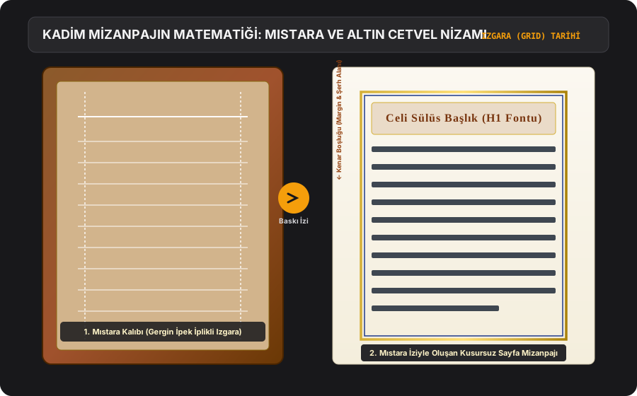
The modern design world systematized the concept of the "grid system" with the 20th-century Swiss school; yet in the Ottoman book arts of the 15th and 16th centuries and in the palace painters' workshops, page layout was already carried out with mathematical order. Before they began to write, calligraphers and illuminators would press the back of the paper with a threaded grid frame called the "Mıstara," fixing line heights, line spacing and column widths with millimetric order.
The gold and navy-blue "Cetvel" (ruled) borders drawn around the text are the ancestors of the margin and border discipline in modern layout. Moreover, the pairing in a magazine of the large, dignified "Celi Sülüs" used in headings with the nimble "Nesih" script used in body text is a universal law of typography, discovered centuries ago by masters such as Şeyh Hamdullah and Ahmed Karahisârî, that underlies today's Display/Body font hierarchy.
Expert Perspectives & Foundational Sources
Sheikh Hamdullah, titled 'Kıblatü'l-Küttâb' (Qibla of Calligraphers); He transformed writing into a living architecture with the aesthetic order he brought to Aklâm-ı Sitte (six types of writing). With 'mistara' (threaded grid ruler) and golden 'ruler' borders used in page layout; It established the perfect page hierarchy centuries before the modern grid system of the West.
Key takeaway for this lesson: Do not place typography haphazardly in the page layout; Create the hierarchy between the title font and the body font and the golden ratio of the margins with the meticulousness of a calligraphy plate.
The approach Tschichold developed for Penguin is based on establishing common rules that can be applied throughout the entire publication series, rather than decorating individual covers. Considering the front, back and back together turns the visual identity into a system.
Key takeaway for this lesson: Instead of reinventing each page in magazine design, establish a consistent system of colons, spaces, headings and style rules.
Vignelli's information design approach is based on making complex content understandable with a small number of consistent visual decisions. Powerful system; It makes typography, alignment, and hierarchy work together.
Key takeaway for this lesson: Make it easier for the reader to focus on the text by using small font size and consistent column structure in the page layout.
"Magazines are intellectual islands where profound ideas converge."
Practical Application & Field Case
In the typographic proportions he designed for Penguin Books and for modern publishing, Jan Tschichold applied the classic page canon in which page margins are distributed according to the golden ratio (1:1.618); even with no ornamentation at all, the pages become works of art through these proportions of white space alone.
Note: Examples not explicitly cited are educational scenario models designed to illustrate editorial methodology; names and metrics are illustrative.
Critical Editorial Warnings & Common Pitfalls
- Do not turn off the grid guides and place page elements crookedly by eye.
- Do not forget to calculate the gutter and let text sink into the binding.
- Do not turn the magazine into an amusement park by using a different number of columns, with unrelated widths, on every page.
Lesson Summary & Core Takeaways
- The Grid is the invisible mathematical skeleton that aligns all the visual elements on the page.
- A 2- or 3-column structure maximizes reading comfort with an ideal line length of 50-70 characters.
- The gutter and margins are vital safety zones that keep text from being trapped in the binding.
Finished this lesson?
You can proceed directly to the next lesson. Reading bookmarks, resume reading, quizzes, module exams, and verified certificates are unlocked for students accepted to our 100% free Education Program.
Share this programme with someone you know
Digital Publishing Academy is a free programme on magazine writing, editing and publishing. Recommend it to a friend, a team or your followers who are interested in magazines.
When you earn your certificate you can also share it from your profile with its verification link.